How to create a magazine layout
In order to understand the “how-to” in doing something, you must understand the “why.”
There are four core graphic design principles that will ultimately help your guide magazine layout design. Keep in mind these principles are in no specific order and each carries equal importance:
- Hierarchy — How people read or consume the information, i.e., what’s most important? What are the key takeaways here? And how do you showcase that? You want this information to be visible right out the gate.
- Purpose — As in, why should someone be reading this, why should they care? People need to understand the point of your magazine. Is it something that needs to be communicated through a photo story or with words?
- Readability — Basically, you want your information and magazine to be easy to understand. Or in the very least, you need the purpose to be easy to understand. Are you pairing poetry with images, or are you articulating EOY program goals for a non-profit? Either way, your choice in communication and end goal needs to be clear.
- Balance — Chaos can be art, but it’s not always beautiful or helpful as it pertains to graphic design. You want to strike a balance between a visual or graphic design feeling cluttered or weighted to one side, as well as sparse or empty.
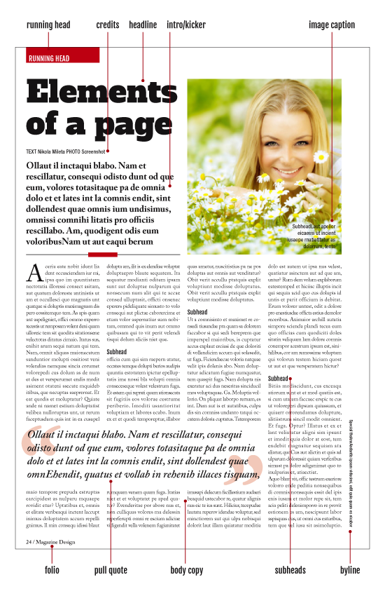
Consider your use of major parts of a magazine EDITORIAL:

THE COVER HAS DIFFERENT PARTS:

|
Headlines
First and most important textual element on a page is the headline. The headline is as important as the layout. After the reader opens the page first thing that catches his attention is the layout or some dominant image. The headline should be set in the bigger size regarding other text elements on the page. Intro (kicker, stand-first, deck) As you can see there are many names for this type element. I prefer to call it “intro”, although the most used name is “kicker”. I call it “intro” because this is an introduction to the article. After headline catches the attention of the reader, intro acts as a bridge between headline and body copy. It sets the tone of the article and briefly describes what can you expect from the rest of the article. Intro text should summarize the story and attract reader’s attention. From the design point of view intro should be set in bigger type size than body copy but in a much smaller size than the headline. You can also make it in different type style. If you set a headline in serif type, you can use sans-serif type for an intro. You should place intro text just below the headline cause they work as a team. Body copy (body text) This is the largest part of any article. Body copy should be as interesting as the design, as the headline and intro text. What’s the point of having great design and headline if the content is not good? No matter how good the design is, if the main body copy is not written in interesting ways, your magazine will lose readers, slowly but certainly. The size of your body copy should be consistent throughout entire magazine. Headline size should change according to the importance of the article. Intro size can vary also, but your body copy should stay the same, no matter what. Pull quotes Pull quotes serve as a great tool to break up big blocks of body copy and to give a more interesting look to the article. You can use them in conjunction with the image so they together can tell a story in their own way. Pull out quotes can be taken out directly from the body text or they can be summarized excerpts but that will be copy editor’s decision. Design related, your pull out quotes should be set in a big enough size that it pulls reader’s attention but this size should not be nearly as big as headline’s. You can emphasize the pull quotes with frames, you can put it in a circle, you can place it inside big exaggerated quote signs and so on. Subheads Subheads are used to break up the body copy and to give some clever insight into what the reader can expect in the next few paragraphs. The reader may be putting off if he sees long blocks of text and subheads should be placed to break those blocks and to denote a new section or chapter. You should set your subhead size just a bit larger than body copy, or you can leave it at the same size as the body copy but emphasize it with some bold font version. Whatever you choose you should distinct them from the body copy. Do not place subheads just below images, do not place them in the last 3 rows at the bottom of the column and do not place them at first 3 rows at the top of the column. Never ever place them at the top of a column. They do not serve any purpose there. Also, do not place them below pull-out quote. Subheads should work as a separate unit and nothing should get in their way. Image captions These are parts of the text that should work with the image they relate to. Image and image captions should work as a unit. The copy editor should find some nice copy to be placed on the image or below it. Avoid placing image captions above the images. This is bad design. The type size should be big as body copy, or around that size. It can even be smaller for a point or two. You can set it in a different style than body copy. Image captions are usually set in sans-serif type for this kind of type has better readability on image backgrounds and at smaller sizes. Bylines and credits Treatment of these elements is determined by the importance of the authors and photographers that worked on the article. If you are using stock images and you outsource the writing of the article you can place the credits vertically near the gutter. On the other hand, if the article is written by a famous journalist and images are taken by the photographer you should place bylines just below headline or below the intro text if intro text is located below the headline. Bylines can be set in the same size as body text or it can be set few points larger. Bylines should be smaller on news pages than on feature pages. Gutter credits can be few points smaller than the body copy. Running head (section head) These are navigation elements that guide the reader. If you set them in a brightly colored box and bleed them out of the page they will be visible even when the magazine is closed. Running heads should be carefully designed to reflect the style and tone of the rest of the magazine. It takes the time to get the right design for them and it should be done in the beginning of the magazine creation. Not all pages need running heads but you can place them at the beginnings of the sections. It would be too much to have them on each page. Folio Folio can consist of several elements. The page number is mandatory but others are optional. Others can be publication logo, date, month, section title, web page, but again do not over do it. Few elements are more than enough and you should repeat them all over the magazine. Unlike running heads, folios serve a bigger purpose and should be placed on almost every page. The reader should know in every moment at which page he is or to which page he needs to go. Panels and box copy Boxes are used as news items or as extensions to a long article in which you can place some other facts or data which are relevant to the article. These types of copy are generally shorter in length and have more factual tone. They can be in a form of a text, bulleted text or lists. From the design point of view, boxed text should be set in a different style than main body copy. Usually in sans-serif type, since the box copy is not long and sans-serif type should be avoided for long dense text stories. Size should be around the same as main body copy. |
PLANNING STEPS!
1. CHOOSE A TOPIC
Brainstorm
What is your design going to be about? What is the purpose of your design?
Answer each of the questions provided under planning phase 1 when applicable.
Food/Cooking
Product Advertisement
Shoe Designs
Artist Bio
Dating Column
Dorm Decor
House Remodel
Fashion
Travel
Cars/Automotive
Puzzle or Game Page
Gaming
New Technology
etc.
2. DECIDE ON A SPECIFIC STYLE YOU WOULD LIKE TO WORK IN!
Trending styles!Artist Technique
“Style” Research Images
Students should find at least 3 successful graphic designs created in a similar style to what they intend to use on their assignment. Additional non graphic design style references are welcome.
Be sure to think about who your target audience is that is going to be reading this during these last stages!
Consider:
3. FIND EXAMPLES OF OTHER MAGAZINES MADE FOR YOUR SPECIFIC TOPIC.Inspirational Images
“Layout” Research Images
Students should find at least 3 structural page references for shape/size/organizational techniques. Additional non graphic design layout references are welcome.
4. WHAT INFORMATION SHOULD BE PRESENT?
What textual information will you include? Cite your sources if it is not made up by you!
Just like when you write a paper for your english class, make sure you are not plagiarizing any text that belongs to someone else. Be sure to re-word any information that you include in your own words and if you quote directly that you cite the original article or source.
5. SKETCH OUT A PLAN/COLOR HARMONY?
2 colors max + shades and tints
HAVE A REASON FOR YOUR CHOICE!
Idea Development (sketch/drawings) Students should plan out a sketch demonstrating layout and placement of items within the design space.
1. CHOOSE A TOPIC
Brainstorm
What is your design going to be about? What is the purpose of your design?
Answer each of the questions provided under planning phase 1 when applicable.
Food/Cooking
Product Advertisement
Shoe Designs
Artist Bio
Dating Column
Dorm Decor
House Remodel
Fashion
Travel
Cars/Automotive
Puzzle or Game Page
Gaming
New Technology
etc.
2. DECIDE ON A SPECIFIC STYLE YOU WOULD LIKE TO WORK IN!
Trending styles!Artist Technique
“Style” Research Images
Students should find at least 3 successful graphic designs created in a similar style to what they intend to use on their assignment. Additional non graphic design style references are welcome.
Be sure to think about who your target audience is that is going to be reading this during these last stages!
Consider:
- What will the target audience take away from reading the article?
- What are the major points or major sub topics?
3. FIND EXAMPLES OF OTHER MAGAZINES MADE FOR YOUR SPECIFIC TOPIC.Inspirational Images
“Layout” Research Images
Students should find at least 3 structural page references for shape/size/organizational techniques. Additional non graphic design layout references are welcome.
4. WHAT INFORMATION SHOULD BE PRESENT?
What textual information will you include? Cite your sources if it is not made up by you!
Just like when you write a paper for your english class, make sure you are not plagiarizing any text that belongs to someone else. Be sure to re-word any information that you include in your own words and if you quote directly that you cite the original article or source.
5. SKETCH OUT A PLAN/COLOR HARMONY?
2 colors max + shades and tints
HAVE A REASON FOR YOUR CHOICE!
Idea Development (sketch/drawings) Students should plan out a sketch demonstrating layout and placement of items within the design space.
You will be creating your own magazine advertisement.
Objective:
Students will create a two pages of a magazine using Adobe Illustrator and Photoshop. When completed, students should be able to follow specific guidelines to develop a design with structured visual hierarchy and thoughtful organization.
Terms:
Visual Hierarchy
Elements & Principles (line,shape,shape, size, value,color,texture/unity,harmony, balance, contrast, variety)
Unity
Alignment
Color Harmony
Shade
Tint
Value
Your design should...
Include at least 2 drawn images or actual images:
(organic or geometric subject)
*TIP: It is always better to create your own images. Second best would be to draw on top and customize the stock image.
Designs with "stock image" that haven't been altered or edited in some way will have a less likely chance of getting into a show.
IF they are real images...
1. Take them yourself (use Photoshop to adjust LEVELS & CURVES!/customize)
2. Use Unsplash.com
3. Use stock resources
NO INTERNET PHOTOS! ALL SHOULD BE COPYRIGHT FREE!
Contain no more than 2 colors!
Make sure these colors contrast each other enough for a successful design.
(All shades and tints of the two colors as well as grey/white and black may be used)
Design details (lines and shapes) should be very geometric or very organic creating unity!
Please find a magazine/cover/or poster as an example that will be your inspiration.
I have magazines on the back shelf... you can google for this... or Pinterest!
(Having this example will be part of your project grade)
Be the size of a Magazine 8 3/8" by 10 7/8" (for each page)
Standard Size of a Magazine: 8 3⁄8” x 10 7⁄8” is an economical and common magazine page size. With that being said,
magazine sizes often vary from these two standard sizes. Over sized and under sized magazines can be
produced and their cost per square inch is almost always higher.
Our Project will consist of two pages side to side as shown below!
Pro Tips:
Use fonts that match your images and design qualities!
Alignment is so important. Place everything for a reason.
Leave space on the edges! At least a quarter of an inch for bleed.

|

|


|

|

|

|

|

|

|

|


Student Examples:

|

|


|

|

|


|

